Branding, Design Tips, Website
Don’t Neglect Your Website Footer
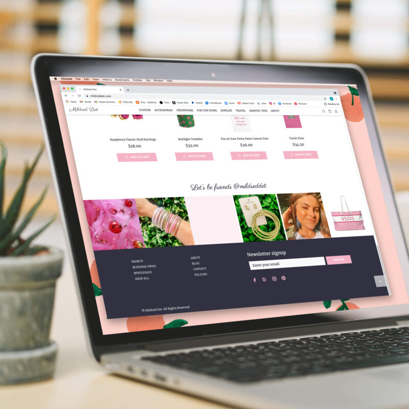
Your website is like a glorious tiered cake so don’t neglect that bottom layer -aka- your website footer. Sure it’s the lowest point of the page but this is a go-to area for the meat of your site. There’s an expectation that if the link someone is looking for isn’t in your main menu, then it’s gotta be in the footer. You also want people to easily navigate your site from the bottom and not feel like they *have to* scroll all the way back up to the top.
Here’s some quick footer tips to spice up the bottom of your site:
Re-cap your core site sections like: About | Contact | Services or Shop | etc. Keep the menu(s) short and sweet and consider breaking them up into 2 columns if you have a list.
If you’re a product biz, put a link to your policies (returns, shipping, etc.). Some e-com sites will automatically have a link to a default policies section when a customer is in checkout but make sure that 1. If you’re using the default that it aligns with your actual policies 2. Edit them to include information about things like returns that typically aren’t in there.
If you have space, put your logo down here or a branded graphic and make it link to your home page. Extra branding + circles people back to the core of your site.
Got a newsletter signup? Your footer is a great area to tuck a box to collect addresses Splash those social icons down here again too because you want those follows so make it easy for people to do it.
Add in your Instagram feed. It not only provides a pop of color and but is also a visual reinforcement of what you do.
Bonus tip: If your website footer be lookin 🔥 on desktop, pop over on mobile to make sure everything is displaying as you want it to. Some site systems consolidate menus into drop downs, change text alignments, or enlarge graphics when condensed in mobile view. All of these things are totally fine but if it’s not the look you’re going for then you might want to adjust or even hide certain things on mobile view.