Project Feature, Website
Children’s Photographer Website Gets a Refined and Refreshed Upgrade
We recently had the pleasure of working with talented children’s photographer, Shana Watkins, to give her website a much-needed refresh. Her work is full of warmth, connection, and joy but her website wasn’t reflecting that anymore. It was time for a new look that truly matched the heart of her business.
From our first conversation, it was clear she had a strong sense of who she was as an artist, but her online presence wasn’t doing her justice. That’s where we came in: to help refine, modernize, and bring new life to her website while staying true to her brand and personality.
The Need for a Refresh
When Shanua came to us, her site was functioning but had started to feel dated and hard to navigate. As a business that thrives on emotional connection and beautiful imagery, it’s important that every element of the site feels aligned with that. Visitors needed to feel welcomed, confident, and inspired… just like they do during one of her photo sessions.
We knew this project wasn’t just about making the site “look pretty.” It needed to work better behind the scenes too: easier to update, optimized for SEO, mobile-friendly, and structured in a way that gently guides visitors toward booking a session or learning more.
A Thoughtful, Strategic Redesign
When we begin any project like this, the first thing we do is listen. We ask a lot of questions: Who are your clients? What do they care about? What makes you different? This helps us get a sense of not only how the site should look, but how it should feel.
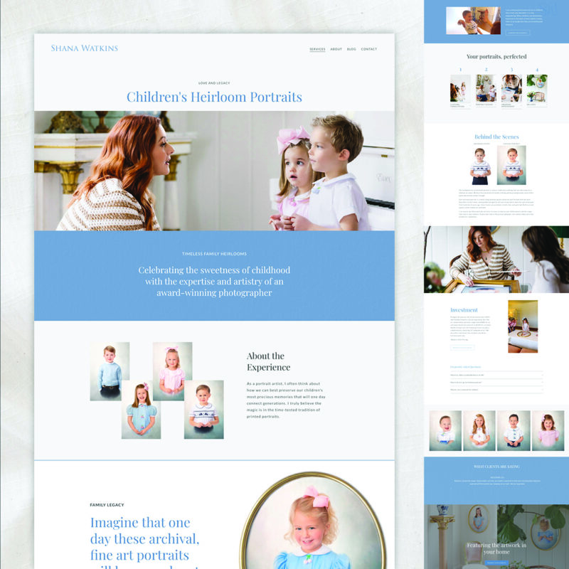
For this photographer, we knew her audience was mostly parents, often moms, who are short on time and deeply invested in capturing fleeting moments with their children. That meant the site had to be easy to navigate, fast to load, and visually engaging right away. Her images do so much storytelling on their own, so the design needed to support them, not compete with them.
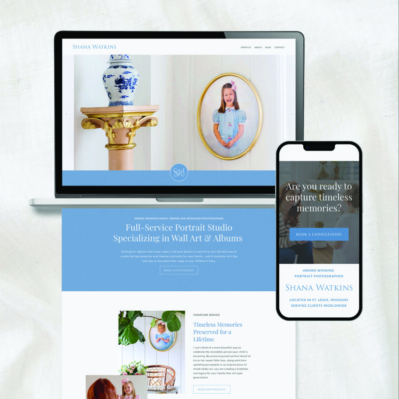
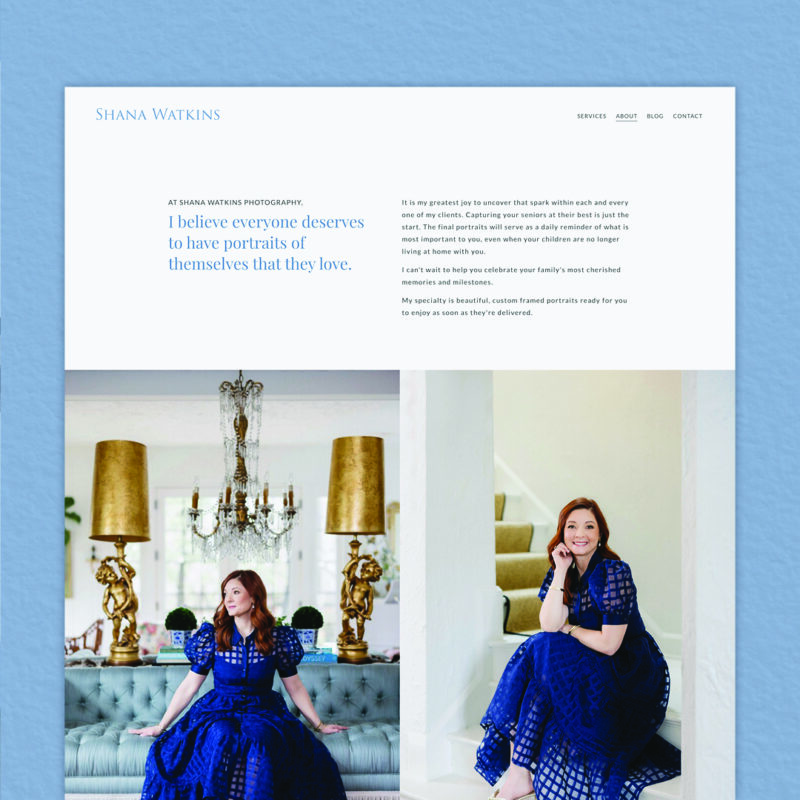
Building on her established branding, we incorporated elegant French blue tones and subtle textures throughout, creating a refined yet inviting aesthetic. Most importantly, we ensured that her breathtaking images remain the focal point, allowing her commitment to quality and storytelling to shine through.
Improving the Experience
Shana’s previous site was built on Wix, but we transitioned her to Squarespace for a more intuitive workspace—making updates faster and easier while integrating custom-coded features and improved SEO across the site.
One of our main goals was to create a better experience for visitors, especially those who are coming to the site for the first time. We reorganized the content to make the navigation more intuitive and prioritized the most important calls to action: viewing the portfolio, reading about the session process, and reaching out to book.
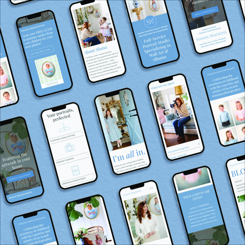
We also focused on optimizing the site for mobile, which is how many people browse these days. Everything now adjusts seamlessly across devices, so her work looks great whether someone is on their phone during a busy morning or browsing on a laptop with a cup of coffee.
Staying True to the Brand
One of our favorite parts of this project was making sure her new site truly felt like her. We don’t believe in cookie-cutter templates or generic solutions. Her brand is personal, emotional, and warm and we wanted every part of the site to reflect that.
We pulled in elements that felt aligned with her aesthetic: soft textures, thoughtful layout choices, and messaging that speaks directly to her audience. We also refined her portfolio display so that her work shines front and center.
Throughout the process, we checked in regularly, shared updates, and made sure she felt comfortable and excited with each step. A website can be a big investment and a vulnerable one when your work is so personal, so we want every client to feel like they’re in good hands.
The Final Result
The finished website is clean, modern, and full of personality. It works hard behind the scenes, loads quickly, and is easy to manage. But more than anything, it finally feels like her.
She now has a digital home that reflects the heart of her business, a place where visitors can connect, explore, and take the next step toward working with her. We’re so proud of how it turned out, and even more thrilled that she’s happy with it too.
Thinking your website might be ready for a refresh too?
→ Explore our portfolio to see how we’ve helped other creative businesses elevate their online presence.
→ Ready to chat about what’s possible for your own site? Reach out to book a discovery call — we’d love to hear about your goals and how we can help.